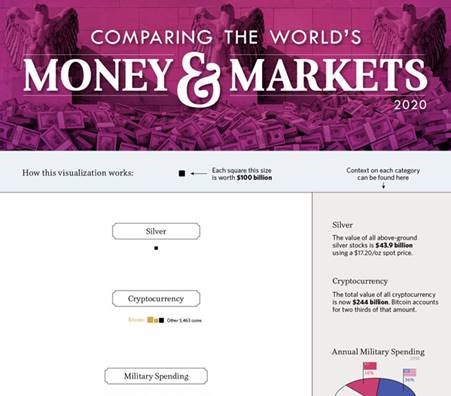
This infographic represents all of the world’s money, in increments of $100 billion. You can literally see the relative size of stock markets, the Fed’s balance sheet, the holdings of all billionaires, cryptocurrency, gold, derivatives, national wealth and much more. Many thanks to Visual Capitalist.
Click the image for a larger detailed view.
See more in this Visual Capitalist article, All of the World’s Money and Markets in One Visualization.


